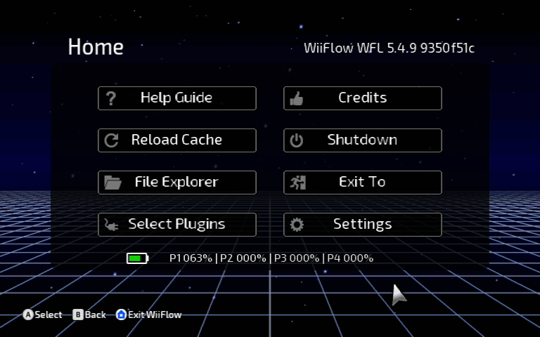
Let's start with the main screen.
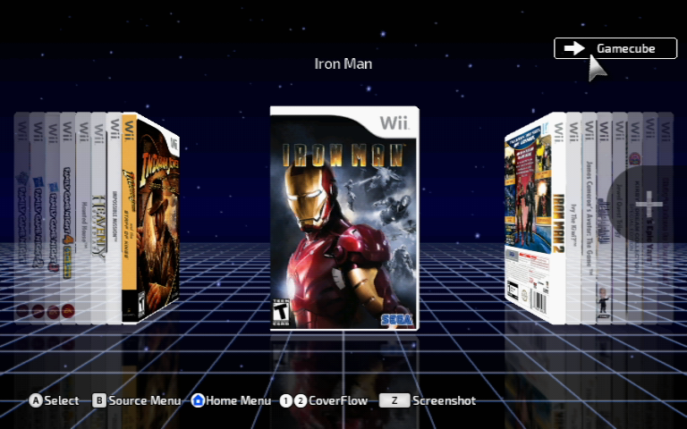
Instead of outright deleting the Source Select button, I decided to turn it into a "Current Source" display, as seen in the upper right of this screen.
When you hover over the source display, it will turn into a button prompt informing you of the next source in the source cycle. Select it and you will go to the next source. I feel like this coexists rather well with SourceFlow, and serves as a nice display when not being used.
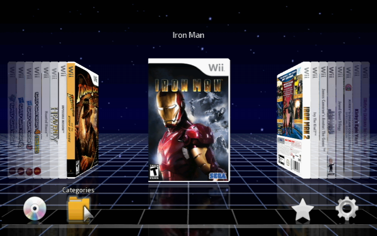
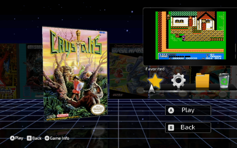
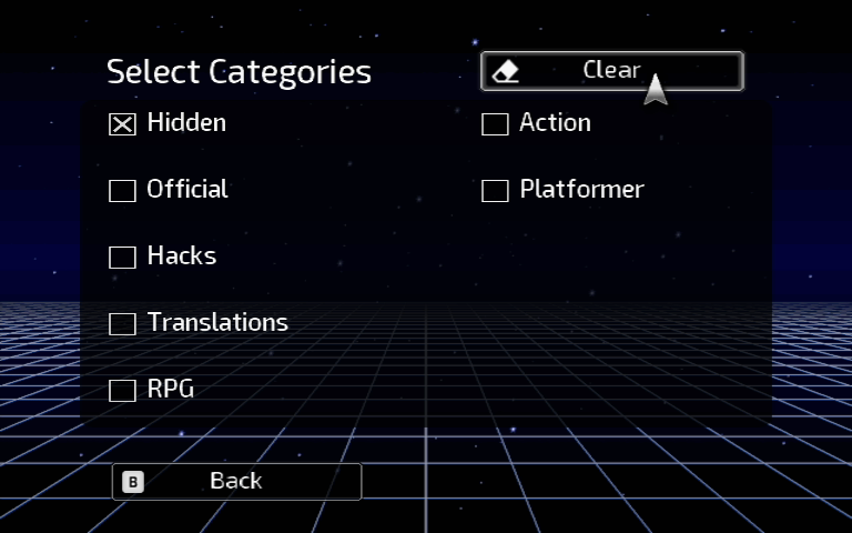
Moving your pointer to the lower part of the screen will bring up the usual icons: Disc, Categories, Favorites and Settings. When you hover your pointer over these icons, a small title will display above them now.
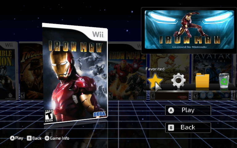
This same improvement has been added to the icons on the Game Selected screen also.
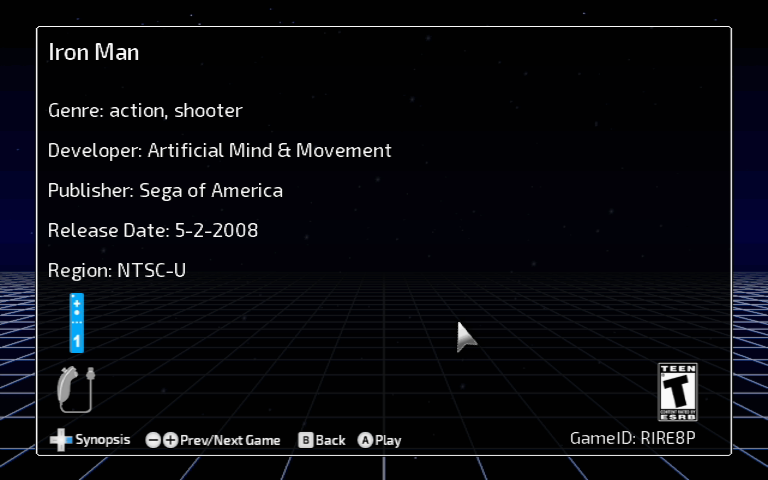
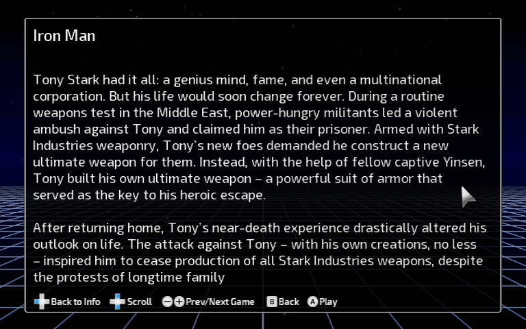
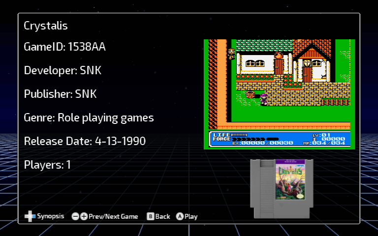
Here's a few screenshots of the Game Info screen on both the Wii and Plugin sources, to give you a general idea of how they will look:
Menu animations overall have been greatly cleaned up and simplified. I don't like when objects move too much, become too large, or travel too far a distance. It was very apparent in the Game Info screen. It now simply fades in when opened, and fades away when you're finished.
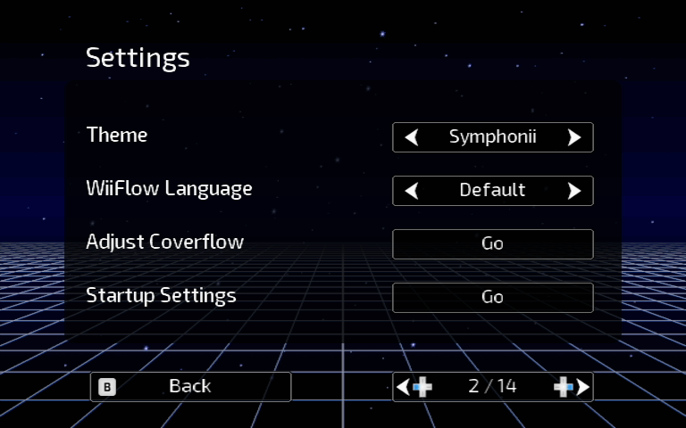
Most menus adhere to a consolidated style, as seen here:
Only one main background PNG is utilized throughout menus. Each page has a user image inserted as a layer behind the buttons, to serve a contrast between the buttons and the background.
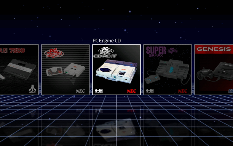
SourceFlow is designed to replicate the look and feel of icons used in modern console UIs.
These are autoboots. Symphonii's sourceflow style lends itself greatly to displaying icons for autoboots, as seen below. They're handy to have for games you play often, and don't want to spend a lot of time browsing for. I usually keep a few on the base SourceFlow menu. It works very similar to how modern consoles boot games.
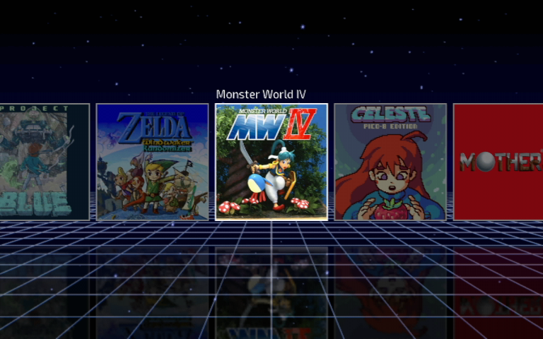
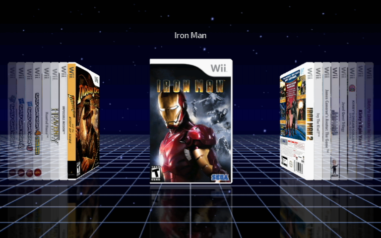
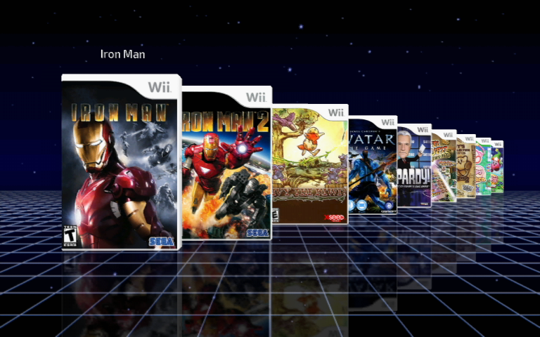
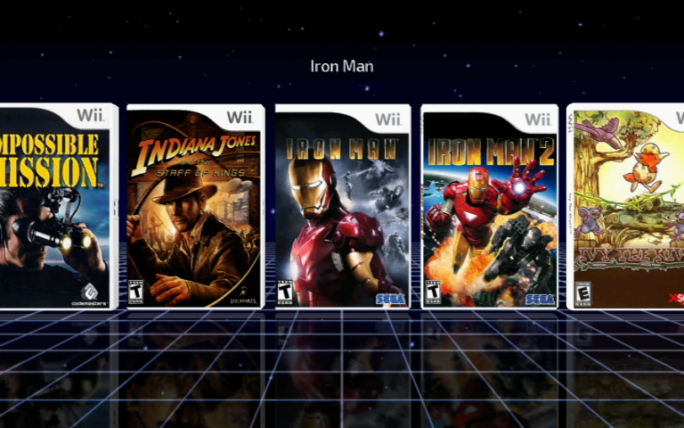
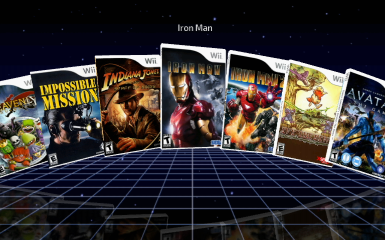
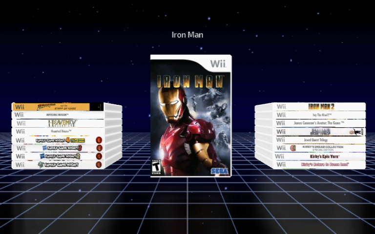
Each platform has these 5 CoverFlow styles as follows:
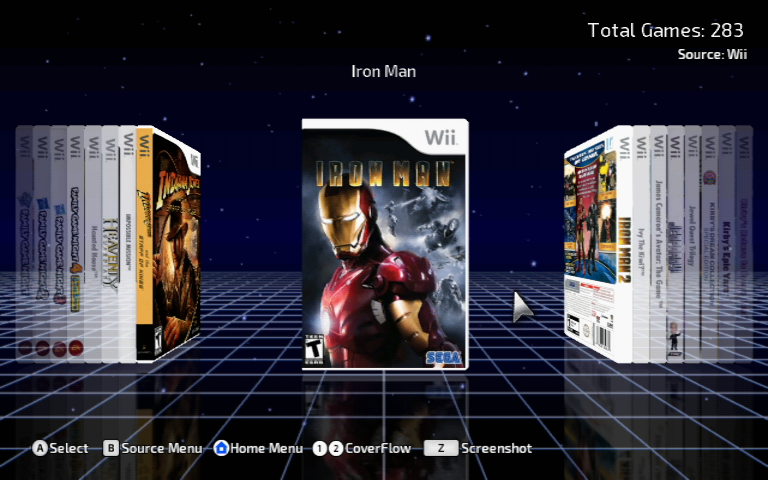
Bookshelf
Fallback
Classic
USB Loader GX Style
Stacks


 @
BigOnYa:
He was the ass of gbatemp, everyone knocked on him, I honestly felt bad, even though I was guilty myself, but he egged it all on himself,
@
BigOnYa:
He was the ass of gbatemp, everyone knocked on him, I honestly felt bad, even though I was guilty myself, but he egged it all on himself, @
K3Nv2:
Online or not there are still certain rights that judges would have no issue handing out a warrant over
@
K3Nv2:
Online or not there are still certain rights that judges would have no issue handing out a warrant over